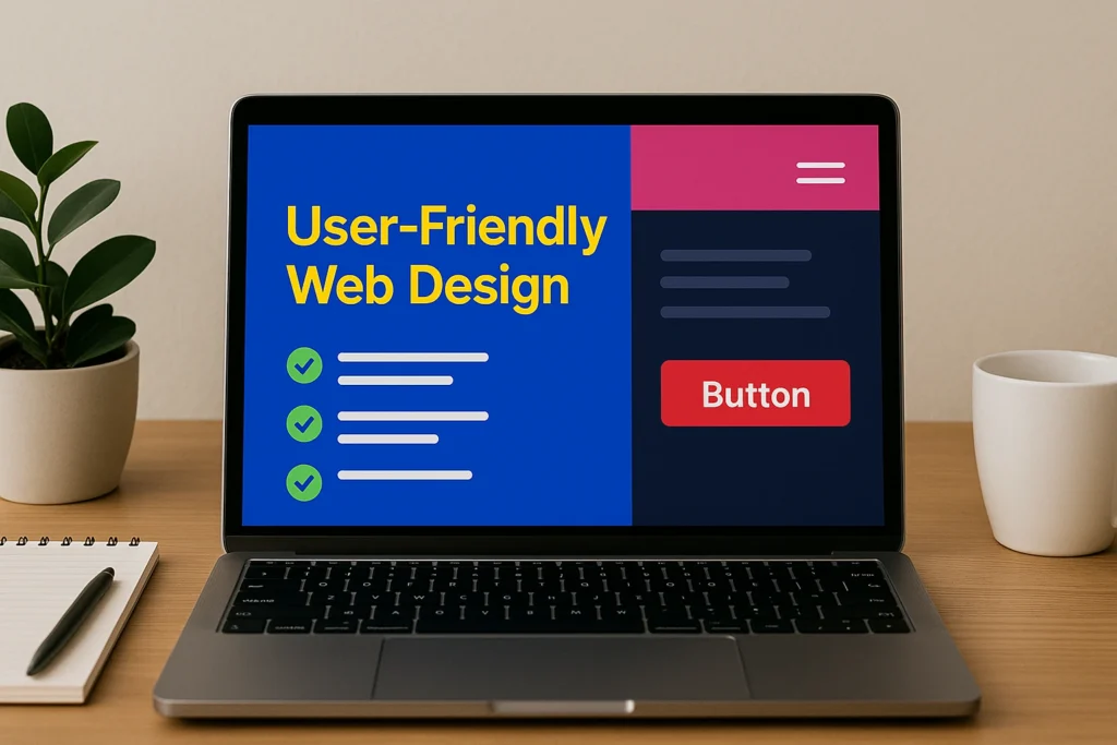
Turn Clicks Into Sales with User-Friendly Web Design
You’re getting traffic, but not conversions. What’s going wrong?
Often, it’s not your products or pricing, but the design. Cluttered layouts, unclear navigation, and missing prompts can frustrate users. If they can’t find what they need or feel unsure about what to do next, they’ll leave.
User-friendly web design can solve this. It removes confusion, builds trust, and guides shoppers from landing on your site to completing a purchase. This article will unpack how smart decisions in eCommerce website design, like clear navigation, strong calls to action, and fast load times, can help you turn visits into sales.
Let’s begin by looking at what makes a website truly user-friendly.
What Makes a Website User-Friendly?
A website is user-friendly when it is easy to navigate, quick to load, simple to understand, and pleasant to use on any device. This involves a clean layout, mobile responsiveness, clear menus, readable fonts, and helpful visual cues.
Basically, a user-friendly website should feel like walking into your favorite local store: neat shelves, clear signs, and no confusion about where to go next.
What matters most is how it works for the people using it. From the moment someone arrives on your homepage, they should feel comfortable and confident about what to do next.
Here’s what to focus on when designing a user-friendly eCommerce site:
- A clean, uncluttered layout that keeps things simple and easy to scan
- A responsive design that looks and works great on phones, tablets, and desktops
- Clear menus and a strong search tool that help people find what they want fast
- Fonts that are easy to read and colours that match your brand without overwhelming the page
- Icons and visual hints that gently guide users through each part of the site
When people enjoy using your site, they’re far more likely to trust you and make a purchase. But while all of these details matter, there’s one design feature that underpins everything: navigation.
Let’s take a closer look at how intuitive navigation can shape the entire shopping experience.
Intuitive Navigation: Don’t Make Me Think
When your navigation is done right, most people won’t even notice it. That’s the goal. It should quietly guide your visitors through your site without friction. But when it’s done poorly, people feel lost, and lost visitors rarely become customers. That’s why intuitive navigation is such an important part of user-friendly web design.
Here’s what works and what doesn’t:
Use Clear, Predictable Labels
One of the simplest ways to make navigation easier is to use labels people recognise. Choose terms that are direct and familiar:
- “Shop All” instead of “Browse”
- “New Arrivals” rather than “Fresh Finds”
- “Contact” instead of “Say Hello”
These choices help users quickly understand what each link does and where it will take them. Trying to be clever with menu labels often creates more confusion than charm. When people know what to expect, they’re more likely to keep moving through your site.
Organise Product Categories Logically
Once your labels are clear, your next step is organising your products in a way that feels natural. Think about how your customers search for things. Start with broader categories, then give them ways to narrow their choices. For example:
- “Clothing” can be broken down into “Men’s,” “Women’s,” and “Accessories”
- Use filters for colour, size, brand, and price
This makes shopping feel more manageable and less overwhelming. Breadcrumbs can also help by showing where users are on the site and allowing them to easily backtrack.
Make Search Simple and Powerful
Even with well-organised menus, some users will prefer to search directly. That’s why having a strong search tool is essential. Your search bar should be easy to find on every page and capable of handling misspellings or incomplete terms.
Autocomplete suggestions can help guide people toward the right results. Filters like sort by price, reviews, or new arrivals also improve the experience by helping customers narrow down their choices without frustration.
Guide the Journey, Avoid Dead Ends
Once users are browsing or viewing a product, your job is to keep them moving. Avoid dead-end pages that don’t offer a next step. Here’s how:
- Add internal links to related products or collections
- Use “You may also like” sections
- Offer navigation prompts like “Continue Shopping” or “Back to Results”
Every click should lead to something useful or actionable. This kind of structure builds flow and keeps users engaged longer.
Keep Menus Consistent Across Pages
Consistency in navigation builds trust. If your menu layout, buttons, or category structure changes from one page to the next, users have to relearn how to move around. That creates friction and can make your site feel disjointed.
Make sure your menus stay in the same place and look the same across all devices. On mobile, stick with simple icons and thumb-friendly designs. Sticky menus, which stay visible while scrolling, are a helpful feature that makes sure users can always find their way.
If visitors can get around easily, they’re one step closer to doing what you want them to do. Now it’s time to nudge them toward action, like buying, booking, or signing up. Let’s talk about call-to-actions.
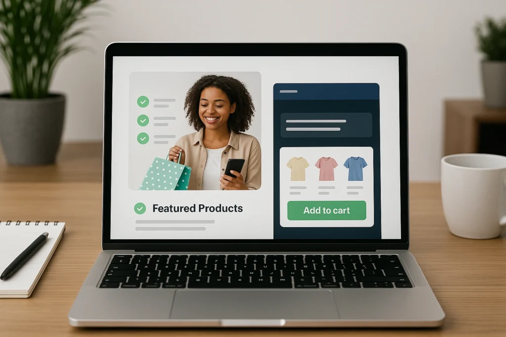
Designing Effective Call-to-Actions
Once your site feels easy to explore, CTAs (Call-To-Actions) help your visitors decide where to go next. These prompts such as “Book now,” “Subscribe,” or “Get your free quote” show visitors the next best step. But a strong CTA makes them feel good about doing it.
Here are some simple tips on how to do that:
Be Clear About What You Want the User to Do
Every page on your site should have a clear purpose, and your CTA should reflect that goal. If users aren’t sure what action to take, they’ll often do nothing at all. That’s why it’s important to use language that is specific and easy to understand. For example:
- Use “Add to Cart” instead of “Select”
- Say “Start Your Free Trial” instead of “Click Here”
- Choose “Buy Now” rather than “Submit”
Providing clear direction on what comes next helps users take action without second-guessing.
Make Your CTAs Stand Out
Once your message is clear, you need to make sure it gets noticed. A CTA should be easy to spot, even at a quick glance. To do this, focus on contrast and placement. Use:
- Colours that stand out from the rest of the page
- Bold, legible text that’s easy to read
- White space around the button so it doesn’t get lost in the design
Place your primary CTA above the fold so users can act right away. On longer pages, repeat it further down so they don’t have to scroll back up to click.
Match CTA Design with User Intent
Not all CTAs are created equal, and they shouldn’t all look or sound the same. Think about where users are on your site and what they’re likely to want next. For instance:
- On a product page, they might be ready to “Add to Cart” or “Buy Now”
- At the end of a blog post, they might prefer “Learn More” or “Explore Products”
- During checkout, a clear “Place Order” or “Complete Purchase” CTA helps confirm their decision
A CTA that suits the situation feels less like a prompt and more like a helpful nudge.
Encourage Action with Confidence
Even if someone is interested, hesitation can still stop them from clicking. That’s why your CTA should be supported by small details that build trust and remove doubts. You can add:
- Phrases like “Secure Checkout” or “Trusted by Thousands”
- Low-risk reassurances such as “Cancel anytime” or “No credit card required”
- Subtle urgency cues like “Only a few left” to encourage timely action
These extra touches give users a reason to act now rather than later.
A good CTA grabs attention, but a smooth site experience seals the deal. But whether that action leads to a completed sale often depends on what comes next. So, let’s head into the next section.
Speed, Mobile, and Checkout Flow
Getting users to click is only half the job. To convert that interest into a completed sale, your site needs to perform well from start to finish. That means fast loading times, smooth mobile experiences, and a checkout process that’s easy to follow. These are some of the most overlooked parts of eCommerce website design, yet they have a direct impact on your sales.

Let’s look at the key areas to focus on:
Speed Matters More Than You Think
Even a one-second delay can significantly increase bounce rates. Shoppers expect websites to be quick, and if your pages lag, they’ll move on to a competitor.
To avoid this, here are a few ways to improve loading times:
- Compress image sizes without sacrificing quality
- Use clean, lightweight code
- Enable browser caching
- Consider a content delivery network (CDN) to serve content faster
You don’t need to be a developer to care about speed. Tools like Google PageSpeed Insights can show you exactly where your site might be slowing down.
Design for Mobile First
Improving speed is a great first step, but it won’t help if your site doesn’t work properly on mobile. More than half of eCommerce traffic now comes from mobile devices. That means your website must be just as functional and user-friendly on a phone as it is on a desktop.
To make your site mobile-ready:
- Use responsive design so the layout adjusts to different screen sizes
- Make buttons and links large enough to tap easily
- Minimise scrolling and avoid pop-ups that block the screen
- Keep menus simple and easy to access
Mobile shoppers often browse quickly and expect instant access to the products they’re looking for. When your mobile design keeps things fast and easy, you give them a reason to stay and shop.
Simplify the Checkout Process
Once your mobile experience is in place, you need to focus on the final step: checkout. This is where many eCommerce journeys fall apart. Even when customers are ready to buy, a slow or complicated checkout can lead to cart abandonment.
To make checkout smoother:
- Allow guest checkout without requiring account creation
- Keep the number of steps as low as possible
- Clearly show shipping costs and delivery times early in the process
- Include trust signals like secure payment icons and customer support access
When everything is laid out clearly and there are no extra hoops to jump through, customers are far less likely to hesitate or walk away.
That kind of clarity and ease is what sets a strong foundation. Now, let’s take it a step further by making your site more accessible and inclusive.
Design for Everyone: Accessibility and Global UX
Making your website user-friendly means designing for everyone, not just the average visitor. That includes people with disabilities, customers in different regions, and users who speak different languages. While accessibility and global usability are often overlooked, they play a big role in building trust, expanding your audience, and showing that your brand truly cares about the customer experience.
Why Accessibility Matters
Accessibility ensures that all users, including those with visual, auditory, motor, or cognitive challenges, can navigate and use your website. In many countries, such as Australia, it’s also required by law. More importantly, it’s the right thing to do.
Designing for accessibility helps you reach more users while also improving the overall structure and clarity of your website. These improvements benefit everyone, not just those with specific needs. For example, using clear headings and proper contrast makes it easier for all users to read and scan your pages.
Here are a few ways to improve accessibility:
- Use high colour contrast between text and background for readability
- Add descriptive alt text for all images so screen readers can interpret them
- Make sure your site works with keyboard-only navigation
- Use clear headings and labels to improve structure and flow
- Avoid flashing elements or autoplay media that can be disruptive
These features make your website more usable, professional, and welcoming.
Think Beyond One Language or Region
If you sell to international customers, your site should reflect that. This means accounting for language differences, cultural preferences, and even local regulations. A good global user experience creates a smoother path to purchase, no matter where someone is shopping from.
For instance, if someone in France lands on your site and sees prices in US dollars with no mention of international shipping, they might leave right away.
To make your global UX more effective:
- Offer language options based on your primary audiences
- Display prices in local currencies with automatic location detection
- Use international-friendly shipping information and clearly state delivery times
- Ensure your contact forms and phone numbers accept different formats
- Avoid slang or region-specific phrases that may confuse global visitors
These simple changes can help visitors from around the world feel more comfortable and confident while browsing.
Build Trust Through Inclusion
When people feel seen and supported, they’re more likely to trust your brand. Taking the time to make your website inclusive shows that you care about your customers and want them to have a good experience, no matter who they are or where they come from.
Inclusive design also brings clear business benefits. It helps improve search engine visibility, reduces bounce rates, and increases engagement across your site. What begins as an effort to support more users often results in better outcomes for your entire audience.
Now that we’ve explored how to make your site work for everyone, we’ll wrap up with a look at how all of these design elements come together to improve eCommerce performance and customer satisfaction.
Make It Easy, Make It Work
We’ve covered a lot, but the main idea is simple. If your eCommerce website is easy to use, people are more likely to stay, shop, and buy. Every small improvement, from faster loading times to clearer navigation and stronger call-to-actions, helps reduce friction and guides visitors toward making a purchase.
User-friendly design is actually about understanding how people interact with your site and making that experience as smooth as possible. When your website feels intuitive and supportive, customers do not need to think twice. They feel confident, and that confidence turns into conversions.
Take a fresh look at your own site. Ask yourself: Is it easy to navigate? Does it load quickly on all devices? Are the call-to-actions clear and inviting? Does the checkout process feel simple and trustworthy?
If the answer to any of those questions is no, then it might be time for a few changes. Even small updates can lead to meaningful results.
Speed, clarity, and thoughtful design add up to a shopping experience people actually want. And the easier it is for them, the more your business benefits.