Reading the Numbers: How to Make Business Dashboards That Tell a Story
Imagine you created a dashboard packed with charts, but nobody understands what action to take. (Your effort has gone to waste successfully.)
And you’re not the first one to make this mistake. There are a lot of businesses that dump a dashboard onto a screen and expect teams to figure out the insights themselves. The result? People spend more time asking, “What does this mean?” than actually making decisions.
What’s the solution here? Well, data storytelling changes this by building a narrative from your numbers that helps viewers go from confusion to clarity.
In this guide, you’ll learn how to create dashboards that change complex data into actionable insights your team can actually use. We’ll also cover the key elements of effective data storytelling, show you real business dashboard examples, and help you avoid the mistakes that kill audience engagement.
Why Business Dashboards Need Data Storytelling
Without proper storytelling, your teams stare at dashboards for minutes. They are clueless without knowing what the numbers actually mean.
It’s because raw data overwhelms people who need quick answers for business performance. When you look at spreadsheets filled with figures or graphs without context, your brain has to work overtime just to understand what’s happening.
The reason you need data storytelling is simple: humans process stories 22 times better than facts alone. An interesting narrative changes raw numbers so your audience can remember and act on them. (Small insights, more brain capacity.)
For example, instead of showing “revenue dropped 15%“, a good data story explains why it happened, what it means for the business, and what action to take next. This approach creates an emotional response that inspires action across your entire organisation.
Key Elements That Make Dashboards Tell Stories
The best dashboards guide your eyes exactly where problems or solutions are. Three key elements separate dashboards that tell a story from those that normally display data.
Visual Hierarchy
Visual hierarchy refers to the size and placement that tell your eyes what your main priority metrics are.
According to Western reading patterns, the top left corner grabs attention first. This is where your most important information should be. And the bigger numbers signal what needs immediate focus on business dashboards.
Context and Comparison
In the dashboard, yesterday’s numbers mean nothing if you don’t have last week or last month too.
For instance, if your marketing team sees 500 new leads today. They wonder, is that good? Here, past data history shows whether 500 new leads are good. Similarly, comparison data answers “so what” before viewers even ask.
Logical Flow
Your dashboard must maintain different logical flows for better readability. For example, information flows from top to bottom, like reading a newspaper article, while Related metrics sit together so viewers connect the dots between cause and effect.
When each section answers one question before moving to the next, you create a natural progression that guides decision-making.
How to Build a Dashboard Using Effective Data Storytelling
Ever notice how some dashboards answer questions while others just raise more?
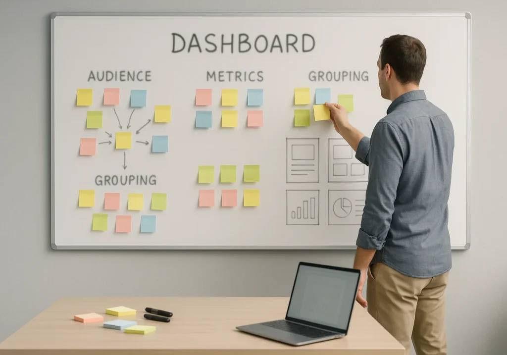
Building a dashboard that tells a clear data story starts with knowing who’s looking at it. This process includes a few necessary steps.
1. Know Your Audience First
As an audience, your executives need high-level trends, while analysts want unfiltered details daily. When a CEO checks business performance, he wants revenue and growth at a glance, not every transaction.
There are also department-specific audiences. Marketing teams track different metrics than sales or finance departments. Meanwhile, Google Ads performance means nothing to your accounting staff. (One dashboard trying to please everyone fails to help anyone.)
2. Pick Metrics That Answer Questions
Choose key performance indicators that solve specific business problems today. Try to avoid vanity metrics that look impressive but don’t guide decisions. Each of your metrics should answer why teams need to track it.
3. Group Related Data Together
When you place Google Ads spend, add the conversion rates and revenue next to it so your team see the full picture immediately.
Don’t spread the same data across multiple charts because the viewers get confused instead of understanding.
4. Add Clear Labels and Annotations
Simple titles beat clever ones every time. We’ve seen dashboards with titles like “The Revenue Rocket” when “Monthly Revenue Growth” would’ve been clearer.
Add annotations to explain sudden spikes or drops that viewers will wonder about. Note “Black Friday sale” next to “November’s sales jump” because context notes prevent confusion and endless follow-up meeting requests.
Business Dashboard Examples That Get Real Results
Real business dashboards show how different teams solve their specific tracking problems.
Looking at dashboard examples helps you understand what works in practice. Here are three types of business dashboards that deliver actionable insights across different business functions.
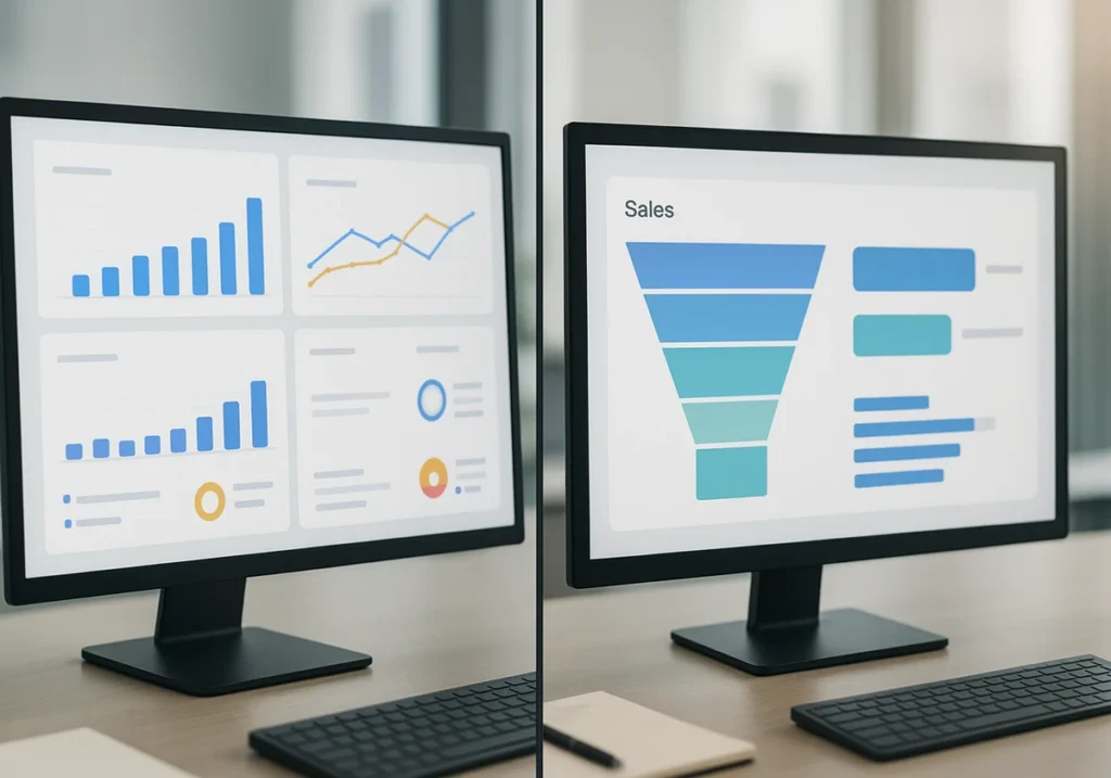
Marketing Dashboard for Google Ads Performance
Shows ad spend, clicks, conversions, and cost per lead in one view.
This dashboard highlights which marketing campaigns waste the budget without delivering quality customer results. You can spot a campaign burning $2,000 weekly with zero conversions immediately. Plus, it compares monthly performance to spot trends in advertising effectiveness over time.
Executive Dashboard for Business Performance
It displays revenue, profit margins, and growth rates at a glance.
Tracks your company’s health through key business intelligence metrics quarterly. CFOs use this to monitor business outcomes without digging through spreadsheets for hours. It also provides drill-down options for deeper insights when numbers look odd.
Sales Dashboard with Key Performance Indicators
This dashboard monitors pipeline value, close rates, and average deal sizes daily.
It clearly shows individual rep performance against team targets and quotas. That’s how your sales team knows exactly who needs support and who’s crushing their goals.
Common Dashboard Design Mistakes to Avoid
Research shows that people can keep only 7 information in memory, which is why they ignore dashboards with more than seven key metrics on screen.
These mistakes kill dashboard adoption faster than outdated data. So, avoid them to keep your audience engaged and focused on what actually needs attention.
Information Overload
If you stuff fifty metrics on one screen, it paralyses viewers with choices. Here’s why less is more:
- Too much data hides the story you’re trying to tell.
- Complex information without a clear focus sends people back to meetings for answers.
- Best business dashboards show seven or fewer key elements at once.
- Presenting more metrics creates a report, not a dashboard.
Missing Context
Numbers without comparison points leave viewers guessing if things are good. Instead, context changes confusing figures into clear insights people can use:
- Displaying data without time periods makes trends completely invisible to users.
- Showing “1,200 visitors” means nothing when it doesn’t tell whether it was up from last week.
- Add benchmarks, historical data, or goals next to every important metric.
- Comparison points help teams understand business performance immediately.
Poor Colour Choices
Rainbow dashboards distract eyes instead of highlighting important data changes. According to PubMed, about 8% of blokes and 0.5% of women have some form of colour blindness. That’s why choose your colour wisely
- Red and green help, but colourblind users miss your entire message.
- Neutral backgrounds with strategic colour pops work better than chaos. (We’ve even seen dashboards that look like a kid’s birthday party.)
- Use colour wisely to communicate insights, not decoration.

How Dashboard Data Leads to Better Decisions
Now that your dashboard has the right structure, make the insights impossible to miss.
Changing your data into decisions requires more than just presenting information. You need to guide viewers toward the action they should take.
Highlight Insights with Visual Sign
Use arrows, boxes, and bold text to direct attention to problems instantly. When metrics slip below acceptable performance thresholds, colour-coded alerts show exactly what needs fixing.
Visual emphasis eliminates searching for what needs your attention now. Your team spots issues in seconds instead of scanning through dozens of numbers.
Show Trends Over Time
Line graphs reveal patterns that single numbers completely miss today. For example, weekly or monthly comparisons expose declining performance before disasters hit. Meanwhile, historical context helps teams understand if issues are temporary.
Create Interactive Drill-Downs
Feature like clicking reveals deeper details without cluttering the main dashboard view. For instance, filters let different teams see relevant data for their work. And interactive elements change static reports so they become exploration tools.
These processes give stakeholders the power to conduct their own thorough analysis.
What’s Your Next Step
You now have the blueprint for creating dashboards that tell clear stories and inform better business outcomes.
The thing is, strong data visualisation helps business dashboards become decision-making tools that create insights fast. Besides, real-time analytics beat fancy charts when teams need answers quickly.
So, start simple and test with your real users often. If you need help in building dashboards that actually guide decisions, check out Dashboard Co-op.
We offer practical tools, business intelligence resources, and an online course that makes data storytelling easier for your team.